Typography claims hoist by own petard
There’s a lovely essay here on Practical Typography about whether Medium’s look and feel is good typography, or more like a frozen pizza i.e. “Not as wholesome as a meal you could make yourself, but for those without the time or motivation to cook, a potentially better option than just eating peanut butter straight from the jar.”
It’s worth reading the essay in full – and it makes some good points.
BUT…
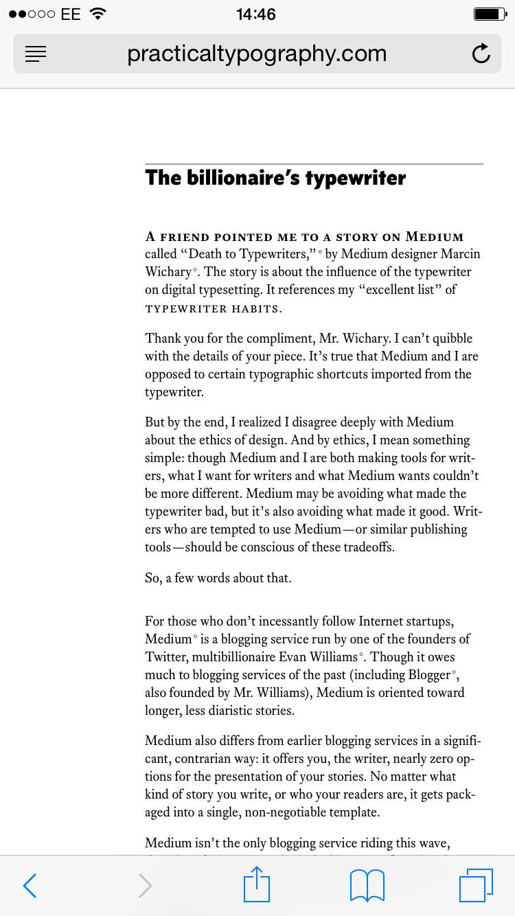
It looks all tiny like this on my phone…

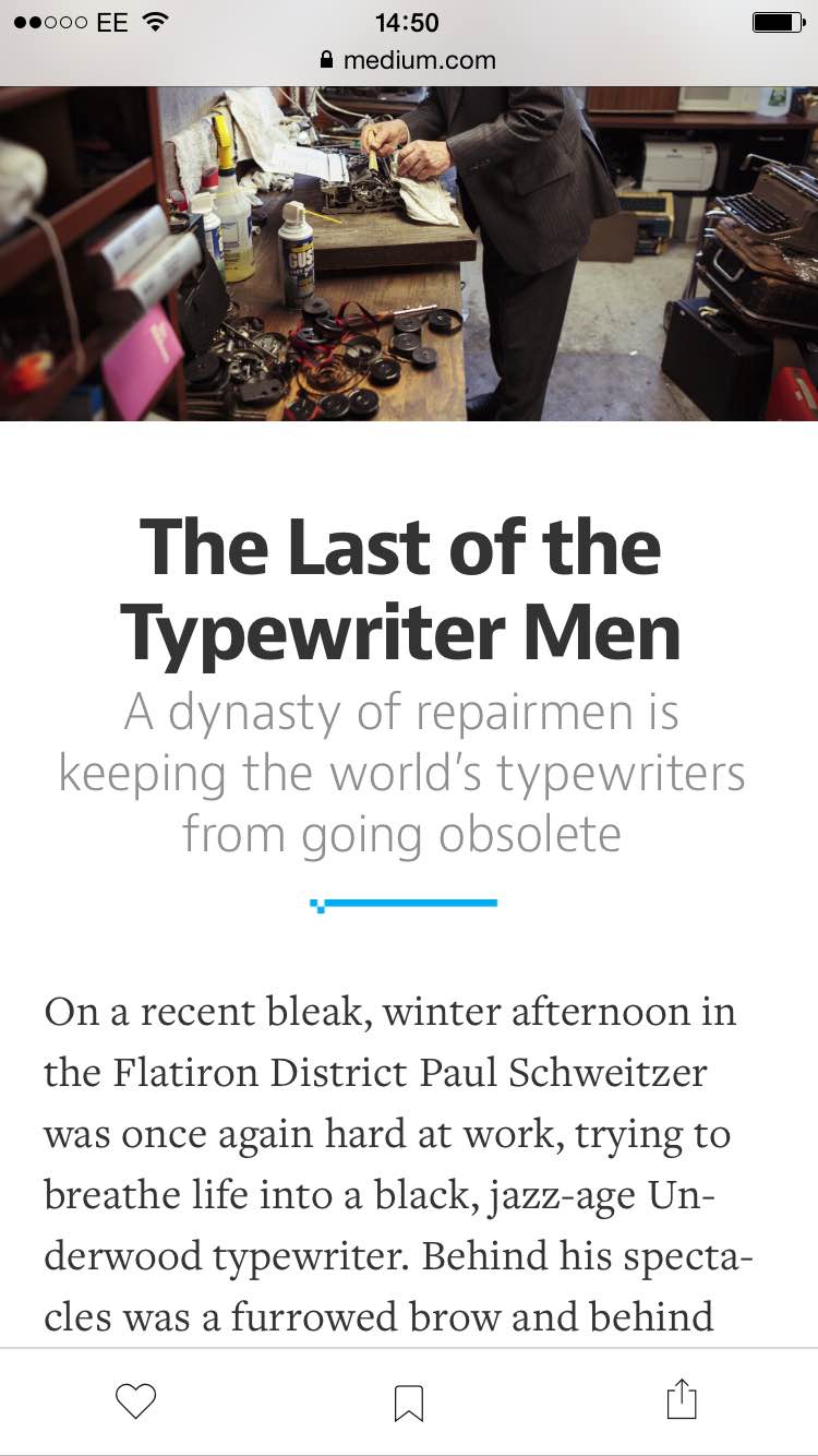
while Medium doesn’t make my eyes all squinty because it looks like this…

So #nope