The death of the homepage in one simple graph
This is a graph. But probably not the one you’re expecting

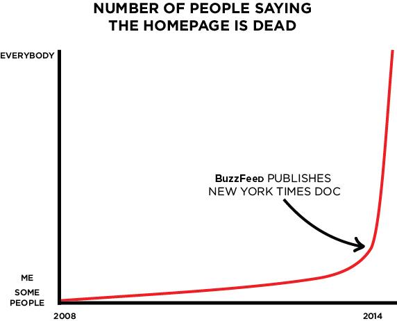
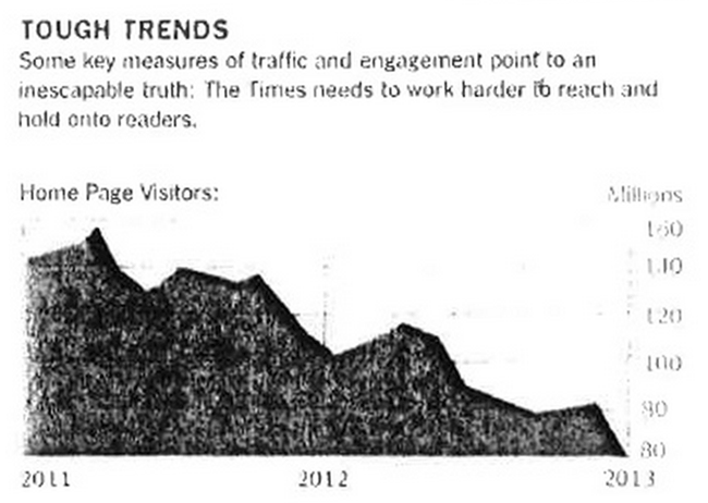
So it’s an odd thing when you’ve been saying something for years and nobody believes you, then suddenly, someone publishes one leaked graph, and overnight all the world agrees with you: The homepage is dead. And they’ve got it wrong.
I first lost interest in the homepage when I was at the Guardian. The newspaper embarked on a massive project to redesign the front. The first meeting had approximately a gazillion stakeholders in it already. I asked some awkward questions like “have we done any user research?” and “what is going to be our measurement for success?” and then slunk away to focus on other stuff. I realised that everybody was going to be so tied up worrying about the homepage, that I’d probably be better off concentrating my efforts on optimising the article page, which made up something like 85% of page views anyway.
I did chip in a couple of ideas to the new page though, both of which I think tried to address the problem with the homepage being a barrier to quickly snacking on content. I did some wireframes of how bits of the page might look if they were pulling in thumbnails from galleries rather than just being a link with an icon. I also worked up the idea of pulling in the latest snippet from live blogs direct to the page. I’m sure other people in the business were working on similar ideas, and Mark Porter and the design team eventually incorporated some of those elements into the page.
I’ve gone much further with Ampp3d. Just like Quartz, we’ve kind of abandoned the concept of the homepage at all. You land on the domain and you are thrown simultaneously into a story and a story list on desktop. On the phone, you are just straight into latest story. Because are pieces are mostly snappy, you are only ever a couple of quick swipes away from getting to a different article that might interest you. I think we only count homepage visits on Ampp3d if you go directly to the ampp3d.mirror.co.uk URL and don’t do anything. It makes up about 3% of our page views since launch.
But here’s the thing.
I don’t think that New York Times graph says what everybody thinks it says.

It seems to me that what we’ve been saying for years is that homepage traffic is going down as a proportion of your overall traffic.
We started in a world where people navigated to a homepage – that’s what the word means after all – and then clicked links and found stories. Then we moved to an SEO-driven world where traffic started coming through the side-door via search. Now, the social era, and word-of-mouth recommendation via services like Facebook and Twitter is a massive traffic driver. All these developments should have been pushing down the proportion of your users who ever visit the homepage.
You should be treating every article on your news site as a homepage.
But a real drop in actual visitor numbers, like the New York Times appears to have experienced?
Ummm, that seems weird to me. There’s got to be other factors at play there rather than just the rise of social traffic.
As Mary Hamilton put it on Twitter about the Guardian’s Australia venture – they didn’t have a homepage about a year ago, and now they are getting plenty of homepage traffic, thanks.
And homepages are still important as a brand statement – you are visiting our site and this is what we have decided is important today. There’s definitely still a place for that.
Sadly it seems to me, it looks like this leaked graph is going to be taken for evidence that “the homepage is dead” – but for the wrong reasons.