Some thoughts on straight lines across UK maps
A good little debate on Twitter today about the fidelity of some of the maps Ampp3d have been using.
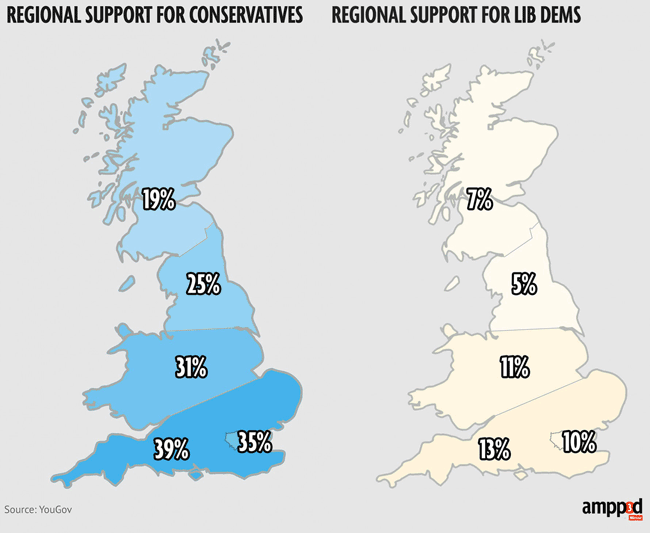
We’ve taken to representing YouGov’s regional survey variations with clearly non-geographic lines drawn across the country, dividing it into several bands. It makes for a much simplified map.
Martin Stabe, a much-admired peer from the FT, very much disagrees with this approach. It would be easy for us, he argues, to get a more accurate geographic representation of the data, and it’s a “cop out” not to do.
@ampp3d what strange "regions" are those on your map?
— Martin Stabe (@martinstabe) April 27, 2014
@ampp3d Since they adjust for census, these are almost certainly aggregates of ons regions, which look like this: http://t.co/HYINicn4Ep
— Martin Stabe (@martinstabe) April 27, 2014
@ampp3d Sorry, but that's a cop-out. You could clear what YouGov mean with one phone call. The correct shape files are open data.
— Martin Stabe (@martinstabe) April 27, 2014
I’ve got to say, I think this is one of those cases where we are both probably right.
Martin Stabe is right. Draw straight lines on a map, and you are either some colonial in the 1800s or 1900s divvying up territory, or you are crudely simplifying something. It isn’t an accurate representation of YouGov’s survey regions.
And obviously I think we’re right too. The straight lines help to convey how unrealistic the data is. Dividing the UK into just five regions, as YouGov do, means the regional breakdown can only ever be a rough indicator, and using rough borders highlights that. I’m more anxious, for example, about there being no way to represent the differences between urban and rural support for the parties in these figures than I am if a few pixels of Northumbria creep into Scotland.
I’d never countenance doing it for actual election data, but this is a small sample indicating “voting intention”. In particular, we feel that merging “Wales and the Midlands” into one bloc flattens a lot of nuance out of the polling, and we want people to see that fuzziness.
Additionally, the simplified map reduces better for small thumbnail previews on social media. Making the lines wiggly on the map makes no difference to the story it tells, but does make it fiddlier to read at lower resolution.
But there’s definitely a problem with it when we post on Twitter. In an article, we put a caveat around the representation:
YouGov break their polling regions down into the following: London, “Rest of the south”, Wales & the Midlands, North and Scotland. We’ve drawn indicative bands across the map of the UK.
If you are upset that you think Derbyshire or Yorkshire are the wrong side of the Midlands/North line, sorry, we’re unclear how YouGov determine that, so we’ve opted to be a bit fuzzy about where the borders sit.
Also, Northern Ireland, apologies, the YouGov poll doesn’t break your results out, or specifically ask about the DUP, Sinn Féin, SDLP or the Alliance, so we’ve not been able to feature them.
Every time we post them on Twitter in isolation, a couple of people will pull us up on it. It’s usually a fellow data nerd. So it’s a choice: make the lines wiggly and perhaps indicate a level of confidence in the regional fidelity of the data that we don’t have, or find a different way of conveying the data.
What do you think? Is it a simplification too far?
I do live blogging, news stories and quizzes at the Guardian, and help cover Eurovision and Doctor Who for them too. As a journalist and designer I’ve spent over twenty years building digital products for the likes of Sony, the Guardian, the BBC, the Natural History Museum, Arts Council England and Reach (formerly Trinity Mirror). You can contact me at martin.belam@theguardian.com. Sign up to get my blog posts sent to you via email.
I’m really struggling to understand your logic here. You don’t think the YouGov regions are particularly accurate so you improve that by making it even less accurate?
Why not just do what Martin suggests and ask YouGov to clarify the regions as they define them?
The conceit that straight lines are essential for small screens is pretty ropey. You have adjusted the Scottish border and London is defined in lots of jaggy detail. It’s almost as if that’s the only bit you care about…
Would an accurate map like the one here http://www.statgeek.co.uk/polling/ really be that tricky?
a) Your link is a 403
b) RTFA – Martin’s said in fairly clear language up there that YouGov doesn’t actually tell you where the boundaries for its self-defined “South” or “Midlands” are.
You’re demanding people use accurate boundaries for an undefined boundary.
(That said, the boundary of ‘Scotland’ should probably be as defined as the one for London, imho. The others, not so much.)
You do have a wiggly lines on your map: those outlining the coastline of the UK. And yet those are also an approximation (just as any map is).
Perhaps your point about the fuzziness of the YouGov region carve-up could be echoed by using less wiggly, more blocky representation of the UK? Perhaps similar to the maps shown on http://en.wikipedia.org/wiki/Coastline_paradox
I think I’m with Cowardly James above (who doesn’t bother to give a real name, so I can happily libel him). However, I also understand the speed that you have to operate at: a call to YouGov would be relatively slow and, in the end, wouldn’t really help. The real story here is one of UKIP not being strong in Scotland and London, and that story is accurately conveyed in the graphic.
I’d be happier if you properly sourced the information you’re using though – because I think that lets you off the hook. “Here’s a dramatic simplification of the data, but here’s the original data to help you make your mind up” makes more sense. In this graphic, I’d put “Source: YouGov bit.ly/2Hr5RT ” (where that bit.ly link, which I’ve just made up, is the actual source document).
To not properly source your data is a “cop-out”, to use Martin’s words; doesn’t take more than ten seconds to do, doesn’t get in the way of the story, and could even be in smaller type (because those that are interested could pinch/zoom).
Accurate sourcing is responsible journalism, and I do wish more people would do it.
Some thoughts on this from Twitter:
Well, I think we’ve pretty much established that I’m in a minority of one and an idiot over this, so there’s that.
More thoughts from Twitter:
@John Handelaar:
YouGov’s regions are neither “self-defined” nor “undefined”. As a reputable polling company, it’s likely (almost certain, even) that YouGov use Census data to normalise their samples. As a result their “regions” they use have real statistical meaning.
If that meaning is unclear — and it is, because as you say YouGov “doesn’t actually tell you where the boundaries … are” — then it’s a journalist’s job to clarify.
So I did. This morning I made a 30-second phone call to the YouGov press office and got this confirmation by email:
In other words, YouGov are, as I suspected, using aggregates of the standard “region” geography units used in all statistical reporting in the UK. The accurate borders for these are easily obtainable.
The need for speed is a valid consideration, as James Cridland says, but in that case a bar chart would have been the best solution to report the findings without introducing a new source of inaccuracy on a map. But since the disclaimer post was written four weeks before the maps at issue were published, there was plenty of time to do basic checks.
Ampp3d, a site which lectures others on accurate data visualisation methods, really should have done this.
@John Handelaar
“a) Your link is a 403″
That should be fixed now. The battle against the bots never ends. :)
@Martin Belam
“Well, I think we’ve pretty much established that I’m in a minority of one”
I suppose it depends on your audience. Your chart is probably sufficient for a five-minute newspaper article, but if your audience is typically made up of political enthusiasts, you will find detractors. My audience tend towards the latter group.
Precision is a double-edged sword, and expectations (almost) always exceed results.