Guardian shows why mobile design has to work for commercial content as well as editorial content
We’ve heard a lot recently about the labels that need to be applied to “native advertising” or “advertorial” online.
If user-testing over the years has taught me one thing, it is that you can always rely on at least some users missing things on the screen, however much you point them out.
Take this blog post: “Shameless Carphone Warehouse Advertorial Masquerades As Guardian Piece on ‘Tablet’ Music Production”. I was intrigued when I saw the headline on Twitter. The post explains that the article only mentions products that the Carphone Warehouse is trying to sell, and finishes:
“And in The Guardian, masquerading as a proper article? You should be ashamed of yourselves.”
Here’s what it looks like online:
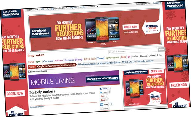
Now forgive me, but I think the Carphone Warehouse, sponsor logo and “advertising feature” are quite strong here.
But hold on a second.
This is how it appears on mobile…
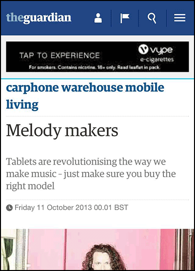
Suddenly Futurilla’s rant makes a lot more sense. I don’t think that does do a good job of showing that this is advertorial content.
The stats are unrelenting. John Lewis got 75% of visits from mobile or table on Christmas Day. Ampp3d already gets more visits from mobile and tablets than it does desktop. News organisations can’t carry on treating the commercial design elements of their mobile sites like second-class citizens.
I do newsletters, live blogging, news stories and quizzes at the Guardian, and help cover Eurovision and Doctor Who for them too. As a journalist and designer I’ve spent over 25 years building digital products for the likes of Sony, the Guardian, the BBC, the Natural History Museum, Arts Council England and Reach (formerly Trinity Mirror). You can contact me at martin.belam@theguardian.com. Sign up to get my blog posts sent to you via email.