“Elegant Tools” with Facebook, GDS, Orange and OpenIdeo
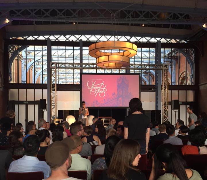
Last night I went to an event called “Elegant Tools” which was hosted by Facebook in the swanky surrounds of the St Pancras Renaissance, which was also once the location for a great episode of Most Haunted.

The evening was introduced by Margaret Stewart from Facebook, who said that part of the motivation behind it was to shine a light on some of the unsung design work that goes into the tools that people use to do their jobs every day.
Regular readers may be aware that I have some STRONG OPINIONS about content management systems and production tools.
Leisa Reichelt – GDS
Leisa Reichelt is Head of User Research at the Government Digital Service. [And full disclosure, I consider a friend of mine].
She explained that her role was to make sure that the people who will ultimately use the things the GDS builds are at the centre of the design process. “Our mission,” she said, “is to make government as easy as possible to interact with.”
An example of this she gave was that they’ve taken long drop-down menus out of their design patterns. User research has repeatedly shown that they are difficult to use for people with mobility issues and hard for people with a low-level of digital skills, so they are out.
If you want to join GDS, Leisa said, “you have to be attracted to the mission”
And crucially, part of this mission is to improve the tools that civil servants have to use, which she said are “pretty appalling”
From personal experience she spoke about sitting watching someone doing data entry to transfer her written visa application into a machine readable format, only for them to make mistakes, which involved more hanging around waiting for them to be corrected.
That’s a common task across the civil service, where information is supplied by citizens or businesses in one format, and it has to be transcribed into another. This ties people up for hours, and causes delay, and has a knock-on effect of people calling up to find out if their application has been processed yet, and it is all ultimately time that is being wasted if you can just design simpler systems.
By building systems that work simply for the most common use cases, Leisa said, it frees staff up to get on with the really human things – like dealing with edge-cases and complex situations, the ones that really need empathy.
She said “These background kind of tools can be difficult to get excited about, but can be the most significant impactful change to a service.”
Leisa talked about a recent initiative called a Contract Design Jam. Anybody who has ever done any procurement involving government will know it is a headache for everybody, and the idea was to put commercial people, civil servants, designers and lawyers in a room to thrash out “does this clause really need to be worded like that?” and “is that really a requirement for everybody to have this in a contract?”
Neil Churcher – Orange
Neil is head of design at Orange, and he was showing a few of the tools they use inside the business. His design team set and monitor design standards for work carried out across multiple platforms and territories for the telco.
In particular he showed an icon library they manage. It is used by about 1,500 people in the business, and contains over 600 icons.
“Everybody wants to know their customers, in this case we had all their emails” he said, also suggesting that the closer working relationship meant people felt much freer to give blunt feedback than perhaps the public are when you are testing products and services on them.
They’ve adapted the tool based on usage data and feedback from the users – “it’s a microcosm of the way we are delivering things for everybody.”
Nathan Waterhouse – OpenIDEO
Nathan is ND of OpenIDEO, a platform for letting companies solve problems by tapping into the knowledge and insights of staff throughout the business, without restricting input to “the creatives” and the big cheeses.
He gave the example of [ANONYMOUS CASE STUDY KLAXON] a large airline, that use the tool to plan their meal provisioning. It’s tricky to get the right number of meal choices on a plane – you don’t want to carry too many unused extra meals because it all costs extra fuel.
What the airline did was ask the crews that flew the routes “what menu do you think we should have for the winter flights to destination X”. Because they’ve got experience with serving passengers on the route, the crowd-sourced answer tends to be more efficient than just someone in head office plucking a menu from thin air.
“It’s about trying to recognise that our software is based on a design process, and based on the idea that everyone in a company has a role or a value to bring to the future of that company, even if they don’t feel they do.”
Margaret Stewart – Facebook
Margaret is Director of Product Design at Facebook, and has previously been at YouTube and Google. When she joined Facebook she asked around for some advice for what seemed to be the best role to tackle in the business, and someone said “Find the biggest mess, and sort that out”
So Margaret chose the Business Tools.
Facebook has 1.4bn people active on the service – “an insane number” she said – and millions and millions of businesses on the platform too. There are “important nodes on the social graph”, and when people talk about a business or service they like to reference.
Traditionally Facebook had been good at making engaging tools for users to publish their personal stuff, but the experience of doing it for a business was pretty clunky. It was also really optimised around desktop usage, and as we know, mobile is where growth is at.
She showed a tool they had built for building business pages and creating ads optimsed around feature phones. For emerging markets like India, the predominant handsets are ones that seem a few years behind in capabilities to the ones we are used to in the US & UK.
They used Snaptu to deliver a much better experience for business users in India, and the creation of business pages and ads soared. A better UX had been the key to unlocking a huge untapped demand, which Margaret described as using tools to “create opportunities out of the long tail.”
Margaret lamented that “so much conversation is all about getting ‘the highest number of people using a product’”.
But it’s not solely about the number using a product, she said, “it’s about the number of people whose lives are impacted by the use of a product. Which is a very different thing.”

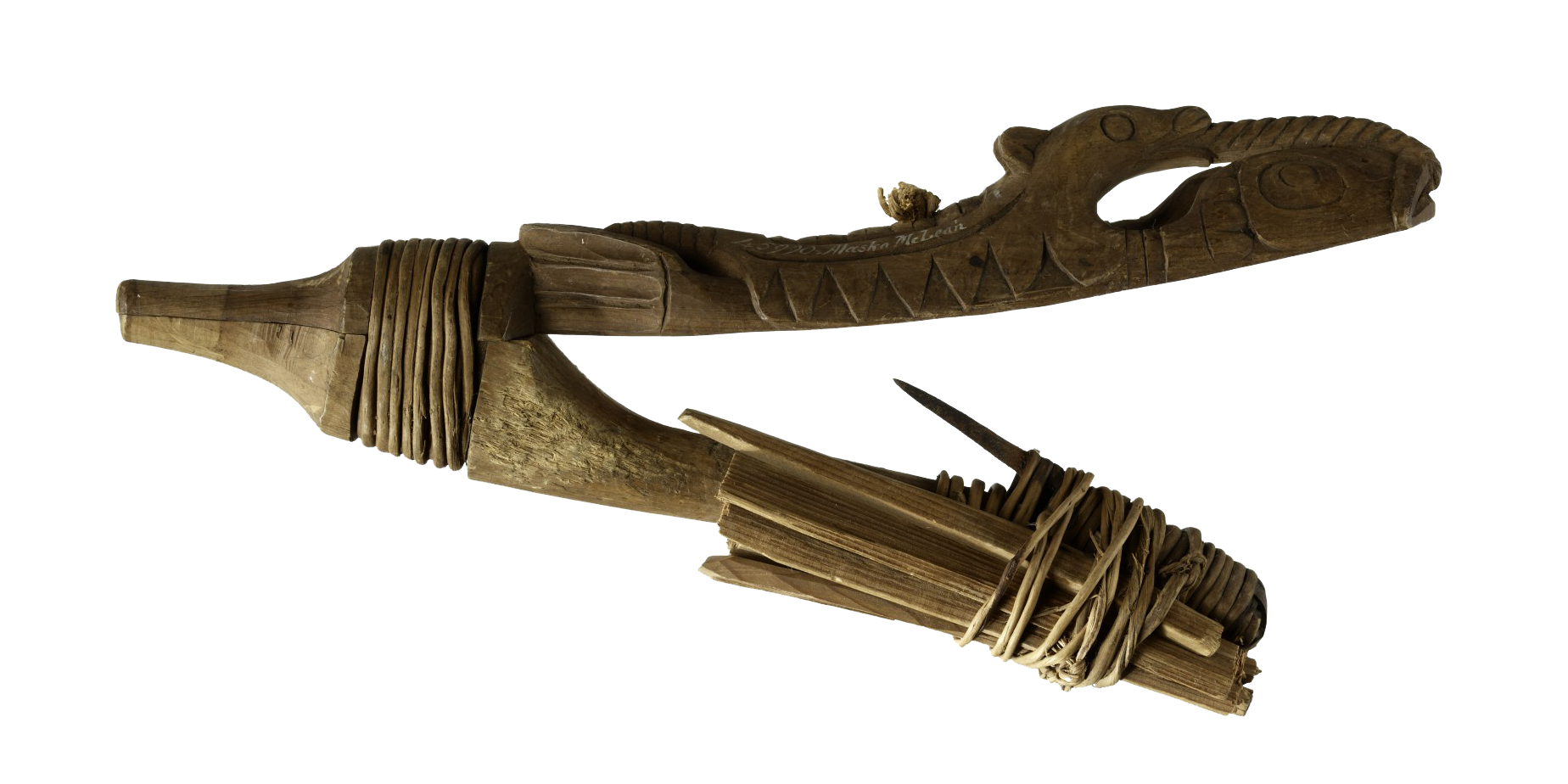
Margaret finished her bit with a short discussion of an Inuit fishing hook. Beautifully crafted, it performed an amazing function – only catching fish of a certain size. You want to leave the younger fish in the water for sustainability reasons, and there is no point catching a fish that is too heavy to pull into the boat.
She said that looking at it made her wonder about the sustainability of attention to advertising, and whether, like the life spirits carved into the fish hook, we as an industry were showing enough respect to the people being advertised to.
You might also be interested in: “CMS – the software UX forgot” – Karen McGrane at Content Strategy Forum 2011