The NYT forcing staff to use their mobile site sends an important message
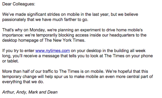
The New York Times are running an experiment to force staff off their desktop machines and on to their mobile phones and tablets.

Mark Coatney has written that it will be “one big pain in the ass”.
I agree with Mark that what the NYT is doing is “not the typical user experience”, but overall I don’t agree with the sentiment and final conclusion of his post:
“All this does is put a roadblock in front of people who are trying to do the already difficult job of putting out a great newspaper every day.”
What the company is doing, as a temporary experiment it seems, is sending out a massive signal to staff who often don’t think or don’t care about mobile that the business does. So they should.
And viewing content on a mobile can be quite the eye-opener for newspaper and newsroom staff who don’t normally think about it.
While I was at the Mirror the default preview view on the CMS was switched to the mobile view, even if you were using a desktop machine. I believe it had a massive impact on people producing tighter, shorter headlines, lead texts and photo captions, once they grasped just how much relative screen real estate they were taking up.
The “roadblock” will be worth it if the end result is the NYT delivering a sharper mobile-optimised editorial product.