“The Ampp3d-ification of news”
No, nobody’s coined or used that phrase yet, so I thought I’d start
We’re eleven weeks into the experiment that is publishing Ampp3d. I’m enjoying it so far. I think we’ve made some great and entertaining content, and I think the site’s Twitter account has already developed a real tone and personality.
Two things that happened today made me think of the phrase “The Ampp3d-ification of news”, so I thought I’d be the first to blog it.
ONS #FACTOIDS
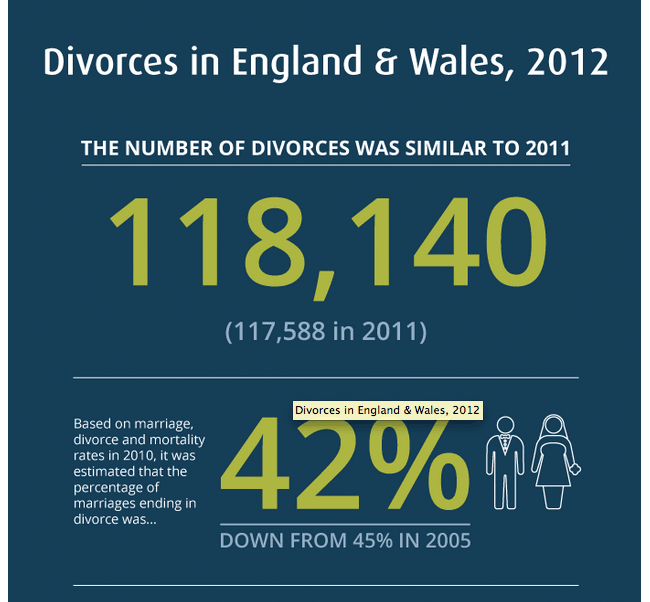
The ONS published a series of infographics today hashtagged #factoids. I really enjoyed them. I know that Ampp3d has been on the ONS radar, and it was interesting to see them take this approach today, and with the divorce infographic they recently produced.
They’ve definitely got more graphic design resource than I have at my disposal.
The DWP and unemployment
This moment of Tweetdeck serendipity happened today – just as I was tweeting an Ampp3d piece about Romanians, Bulgarians and employment, the DWP were tweeting their infographic about the figures.
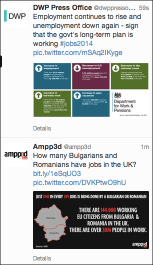
The juxtaposition made me laugh.
“The Ampp3d-ification of news”
The idea of Ampp3d came out of observing trends in presenting data, and trying to find a way we think we could improve on them. We’ve quickly built a human-bot army of Twitter followers who seem to eagerly retweet our graphics when they have a strong fact-based but political angle. I feel like that part of the project can already be marked off as a success. I know we’ve only reinvented the wheel, but at some point someone is going to write about “The Ampp3d-ification of news”, so I thought I’d get the first mention on the web in myself :-)
I do newsletters, live blogging, news stories and quizzes at the Guardian, and help cover Eurovision and Doctor Who for them too. As a journalist and designer I’ve spent over 25 years building digital products for the likes of Sony, the Guardian, the BBC, the Natural History Museum, Arts Council England and Reach (formerly Trinity Mirror). You can contact me at martin.belam@theguardian.com. Sign up to get my blog posts sent to you via email.